


- Artificial Intelligence
- Mobile Design


SpecBooks is the data backbone behind how brands track their own product performance.
More than 15 million enriched SKUs, over 10,000 locations, and $1.8B in specified product value move through the platform every year. Somewhere between design and development, a handful of features got cut. While working at Tekbyt as a product designer, I was tasked to join the team already working on Specbooks and design those flows, features, sanitization, and screens. I picked up work inside an already-shipping part of it, working alongside another designer in a live Figma file.
That's the project: 48h deadline, two designers, one product already live, rebuilding what drifted out before the next sales call.
The hard part wasn't designing a new feature or component. It was that I never saw this product before, and I had two days to understand it well enough to design for it.
The features were missing, Now I had to figure out how this platform works, whats designed and why its designed, and the main thing, “what to do and what not to do while designing for Specbooks”. Getting this context was crucial. All of it inside two days, working alongside another designer figuring out their own half of it at the same time.
Because this was headed straight into a sales call, every real brand, dealer, and product name had to come out before anything shipped. The numbers stayed real. Only the names changed.
I didn't design anything new until I understood what already existed.
Before touching a single screen, I learned what this product actually does for the brands using it, then went through every existing screen and used what was already there, same components, same spacing, same fonts, copied and adapted instead of designed from scratch. Claude was also used for research and business understanding. Every new screen got built the way it would need to exist in production from the start.


Four features, each in different screens for different user segments

A pricing curve shows exactly where a product's own average price lands against the market, below, at, or above, closing on one plain-English line instead of a chart someone has to interpret themselves.

Right alongside it, a rollup table breaks a whole category down into the specific products actually driving its volume, so a brand manager can see which one product is carrying a category instead of just knowing the category moved.

Every state gets scored on opportunity, high demand where the brand's own share is still low, and the highest-scoring states surface a ranked list of the specific dealers behind it. The internal ranking number never shows. Only the result does.

For any one dealer already in the pipeline, a category overlap view shows exactly which categories the brand and dealer already share, splits high-volume from long-tail, and closes on a direct read of where the real expansion opportunity sits.
I built my half so it would look like the same person designed both.
Four new features, split across two people, built inside a product neither of us started. The test wasn't whether each piece looked good on its own, it was whether someone opening the file cold could tell where one person's work ended and the other's began. It shouldn't be able to.
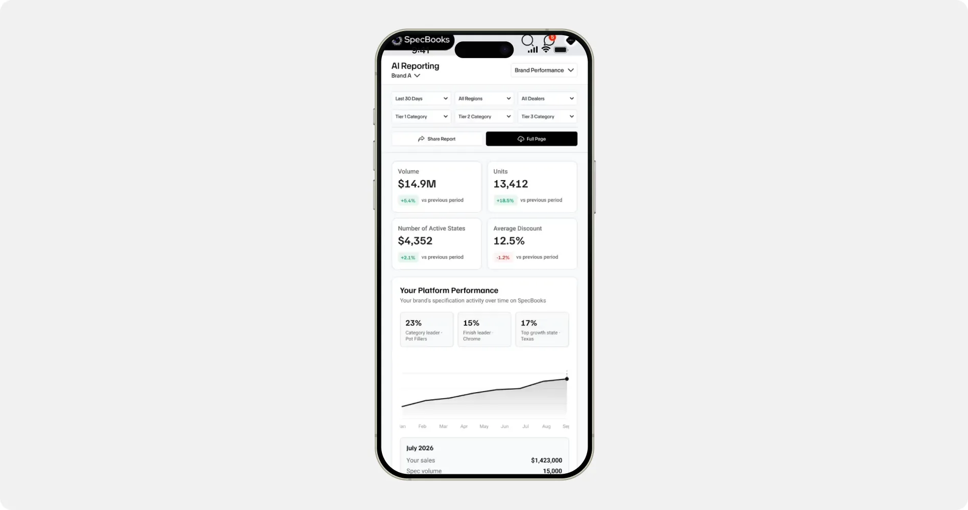
Let’s take a look a mobile views as well as its a complicated part when making dashboards…
We also designed mobile views for all the screens as a part of sanitization work and to include new features.
So, did I manage to beat the clock on that 48-hour deadline?
I delivered all work way before delivery time, including 4 new features, sanitization work, an additional dashboard screen and new mobile views of around 8 screens. Everything went smoothly. I don’t have any KPIs to measure this work. You can see the product live, however, the project was a success and I was able to keep up to deadline as well as deliver everything in brief. Thanks to my co-designer Ahmed for doing an exceptional work with me.
What this taught me
Understanding a product you didn't build is its own skill. None of the usual design instincts mattered until I actually understood what a brand manager was trying to answer when they opened the screen. That took longer than any of the actual screens did.
Reusing what already exists takes more discipline than building something new. It's tempting to solve a problem your own way. The harder, less visible choice was matching what was already there closely enough that nothing looked like a different hand had touched the file.
