


- B2B
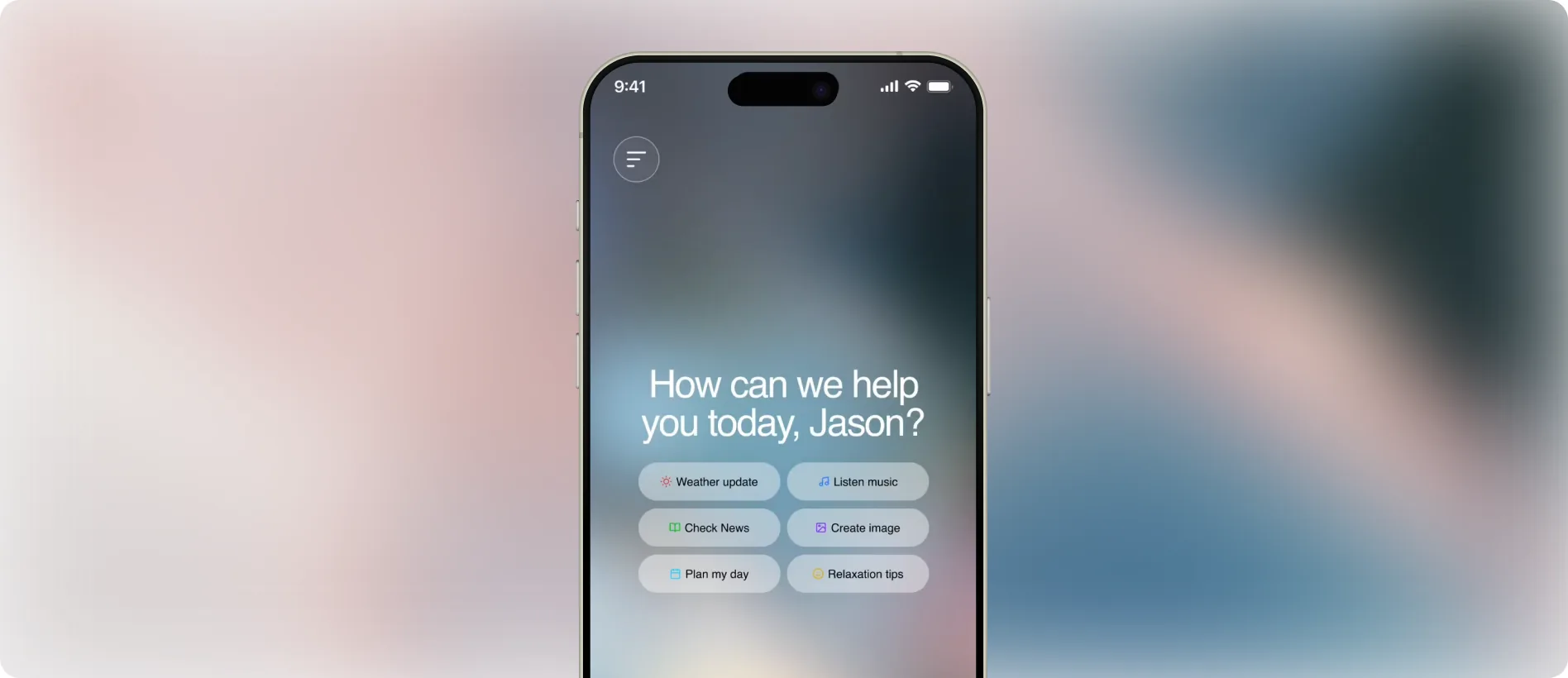

BotBuddy's brief could describe a hundred different AI chat apps already on the App Store.
The actual spec: an AI chatbot for ages 15 to 60, conversational UI, quick suggestions, history, settings, profile, 8 to 12 screens, clickable from onboarding through to core chat. Two weeks, solo, no legacy app to fix and no broken flow to untangle, just a clean brief and a blank file.
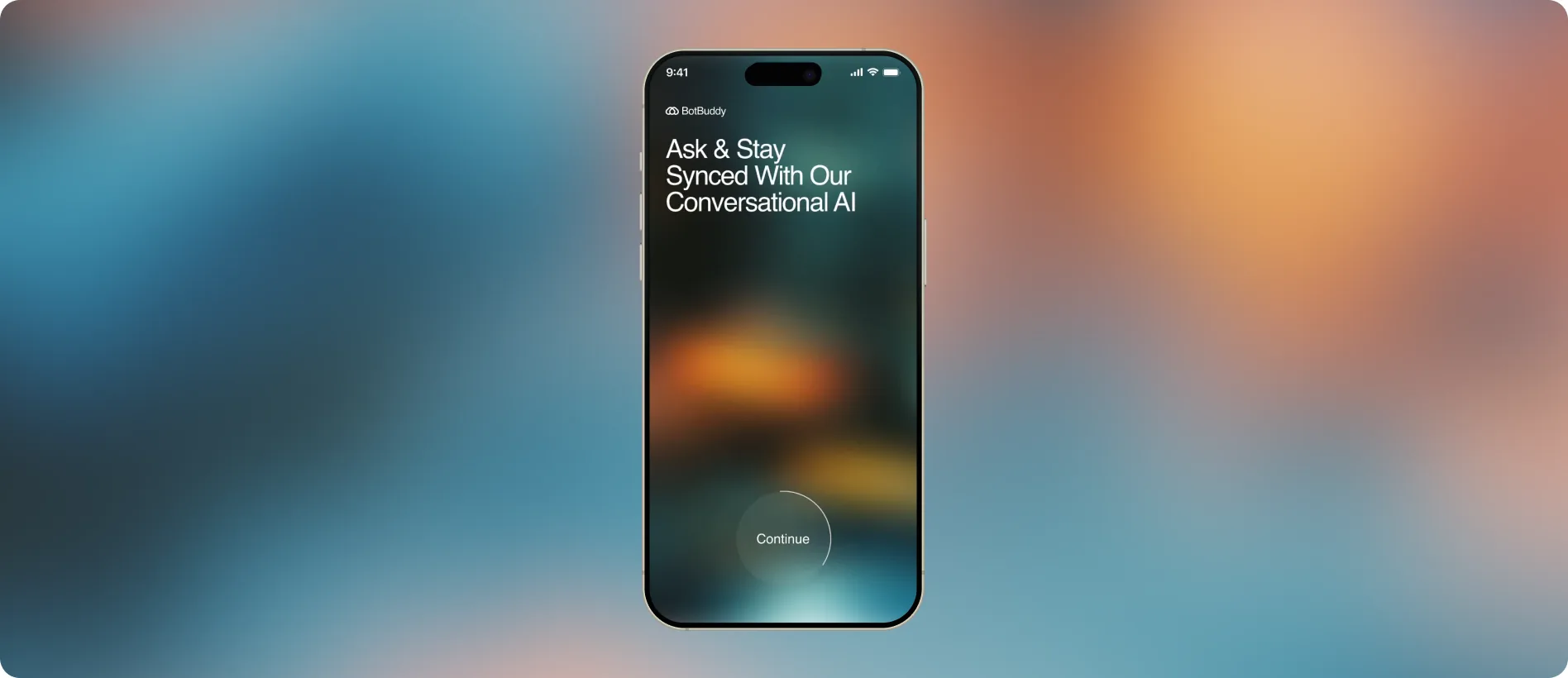
Familiarity keeps people around, but the brief didn't want another app that looks like every other one.
There are already a hundred AI chat apps with the same layout and the same vibe. Jakob's Law says people prefer a product that works the way every other product they already know works, that's part of why they all converge on the same pattern. But the brief wanted something out of the box, not another wrapper. That's the actual tension: lean too far into familiar and it's forgettable, lean too far into new and you risk the retention and churn that familiarity was protecting in the first place.
An AI chat app doesn't leave much room to innovate on top of that. The functions are limited, type or talk, get a message back, maybe act on it, and app integrations were out of scope for this brief too, which boxed the whole thing into day-to-day interaction only, nothing external to lean on except device music, calendar, and clock. The real question became how to make it unique, reflective (as Don Norman states it where people build positive memory of your product), and interactive inside that small a space.
Since the core mechanics couldn't really change, the edge had to come from somewhere else.
A chat app is a chat app: type or talk, get a message back, maybe act on it. That set of functions wasn't moving, and integrations were already off the table, so there was nothing external to lean on either. The one thing nobody had ruled out was the background itself.
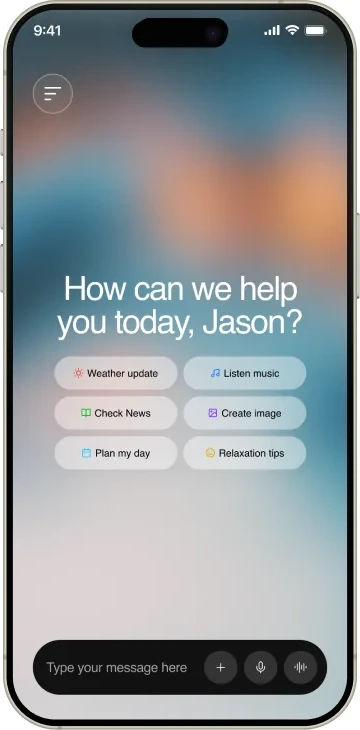
My idea was that gradient behind every screen could be dynamic. It shifts with the time of day, with the mood of the conversation, with whatever's playing if BotBuddy just handed back a song, sometimes just screen to screen. None of it touches how the chat actually works, it's the one part of the app that's alive without adding a single new function, which was the whole point once integrations and new features were already out of reach.

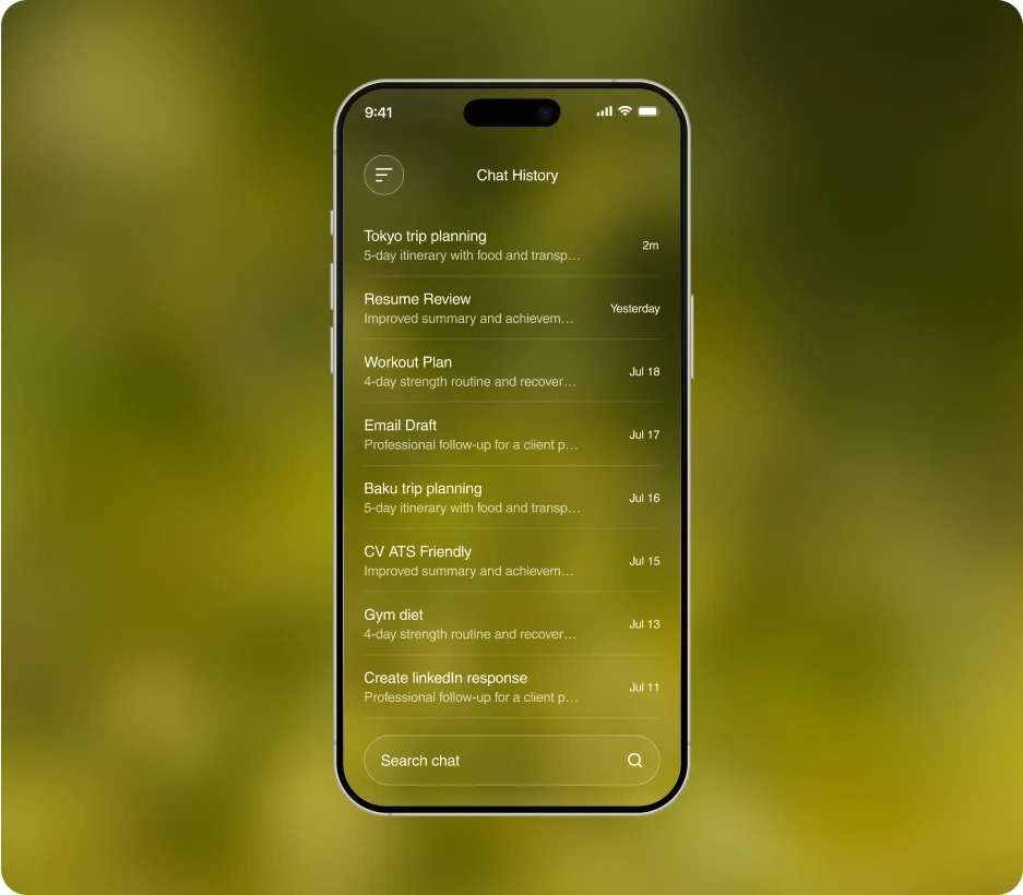
The obvious nav pattern is a bottom tab bar. That's not what shipped.
Navigation lives in a side panel that opens to half the screen from the left instead, with the two actions people actually reach for mid-conversation, search and starting a new chat, placed low in that panel rather than pinned to a top corner.
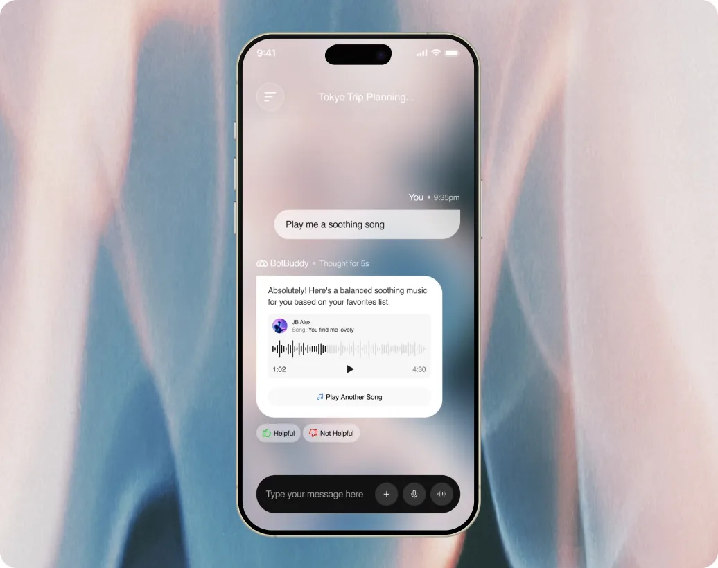
A menu tucked in a corner favors whichever hand happens to be free. A control kept low and central doesn't care which hand you're holding the phone with. Small decision, but it's the one place in this project where judgment overrode “that's just how iOS apps are laid out.”
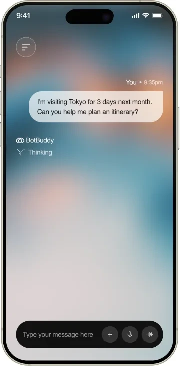
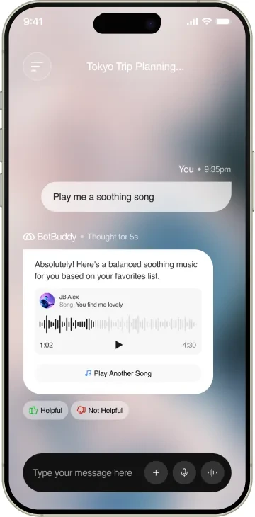
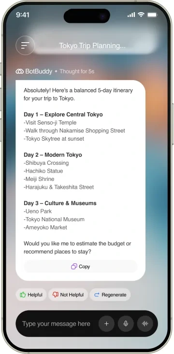
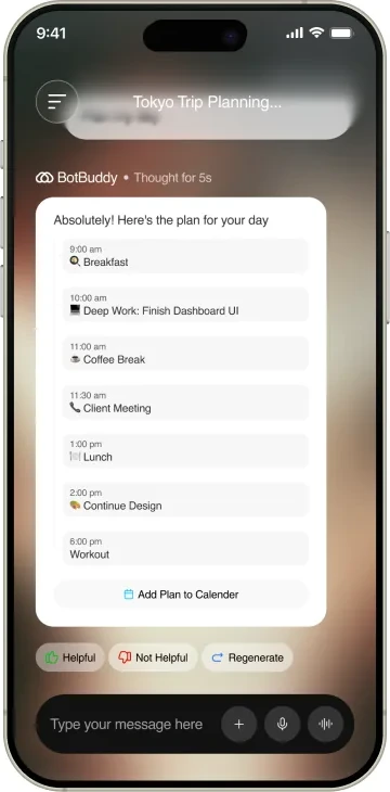
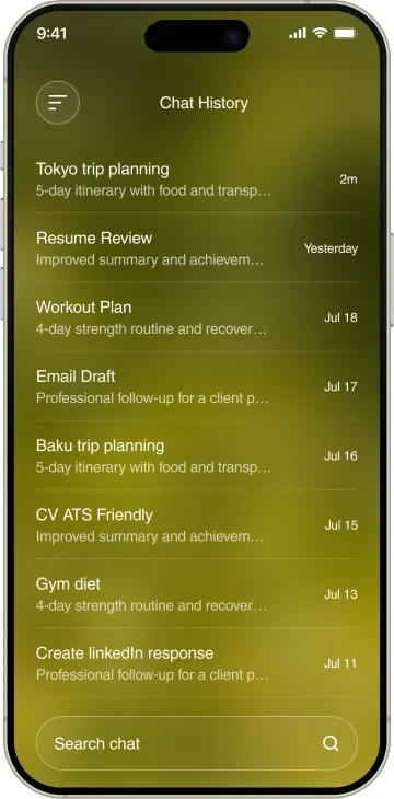
A “Thought for 5s” indicator appears before answers land, the same pattern reasoning-forward AI products use to make a wait feel like consideration instead of lag. Every response ships with a Helpful, Not Helpful pair underneath it by default, not as a later feature. Chat threads name themselves too, a conversation about a trip becomes “Tokyo Trip Planning…” in the list instead of every chat looking identical.
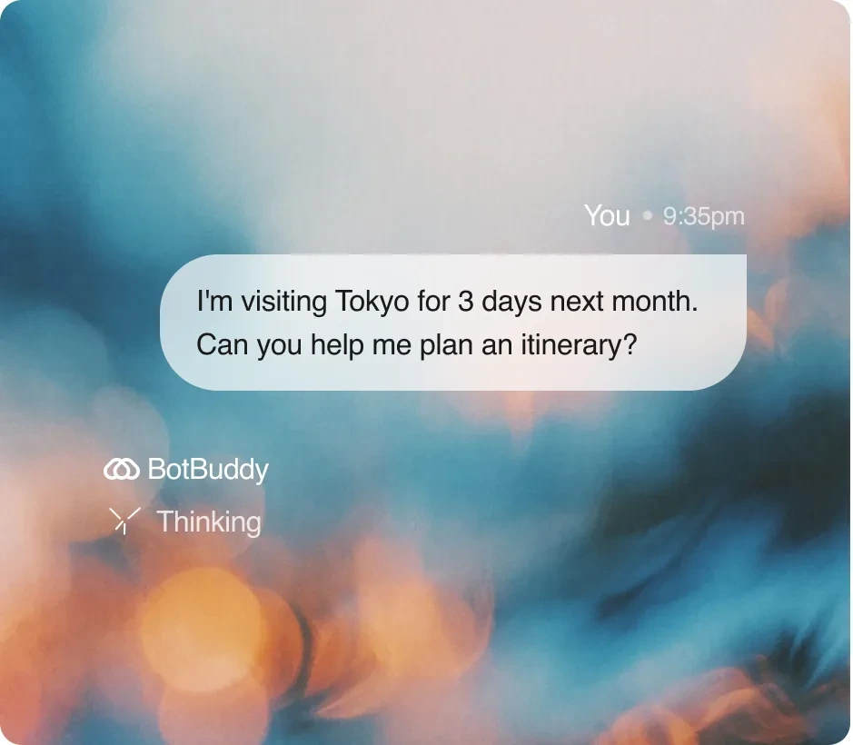
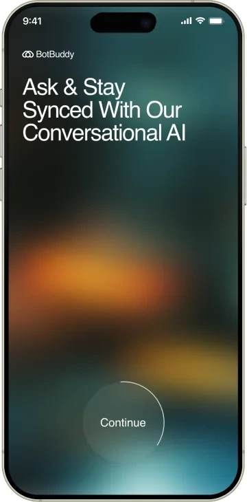
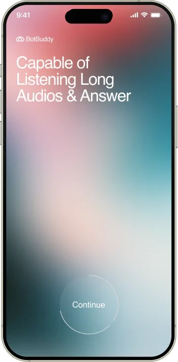
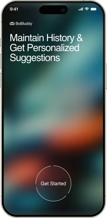
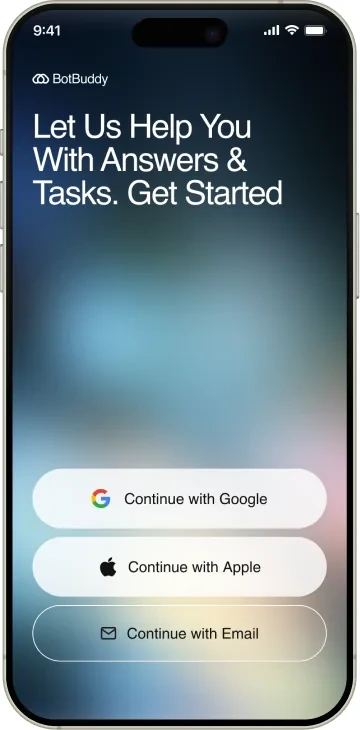
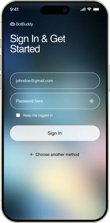
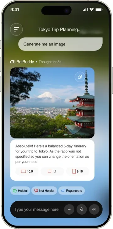
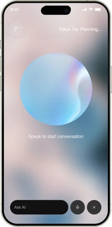
Here’s a quick glimpse of other screens I designed for Botbuddy including onboarding & chat input output screens
What I learned
A locked spec still leaves room to push, if you read past the literal words. The brief asked for conversational UI with quick suggestions. It never said voice had to be a first-class input, or that a response could carry real media instead of just text. The extra scope was already sitting inside the brief, it just wasn't written down.
The smallest details carry the most trust. A five-second thinking indicator and a thumbs up, thumbs down pair are easy to skip when you're racing a one-month solo timeline. They ended up being the difference between an app that feels considered and one that just replies.
